



Collect engagement on a map and the answers arrive with who, what, and where already attached. With the right community engagement tools, that's the easy part. The hard part is that nobody has a week to read a few thousand comments closely enough to be sure they haven't missed a voice.
The solution that makes your findings defensible (even without a GIS analyst!): narrow it with needed filters (by topic, by who responded, by location) and do an AI pass before human analysis becomes possible. And because every step is visible, it's also defensible.
Why is map-based data faster to analyze?
Most engagement data takes days to transform into something useable. Traditional surveys can collect opinions that refer to places, like “First Street is dangerous.” But the locations are given as text, not coordinates. So where exactly are the dangerous places on First Street? Hmm. Described locations are open for misinterpretation. The only way to incorporate this feedback into spatial planning work is to interpret it (fingers crossed) and then manually geocode it. The data analyst or GIS specialist on your team has quite a task to do. In the meantime… the project waits.
It's a different story when input is map-based and georeferenced from the start. Drop a pin or draw a route and Maptionnaire automatically links comments and follow-up questions to that exact location. That single design choice makes filtering, cross-referencing, and reporting nearly instant. Transferring data onto the map isn't a multi-day side-project with yet another tool. It's already done.
The problem: a map scattered with pins doesn't tell anyone's story
Say a transportation safety study collects a few thousand map-based comments (hoorah!). Thousands of points look impressive, but they only hint at the diverse stories, needs, and challenges that your community has. A big, busy map won't answer the questions that community members, interest groups, or decision makers might have:
- “Are scooters a widespread concern or just concentrated to a few hotspots?” (You need to filter by topic)
- “How do we address low-income community members' safety concerns?” (You need to filter by who responded)
- “Are there specific safety concerns on First Street?” (You need to filter by location)
The stories are behind and in-between the points on the map. Who's affected? What's happening? Where? Why is this important? That's exactly where data filters do the work. And without needing a full afternoon of manual cross-tabulation.
How do you filter map comments by topic or category?
If you've tried using different colors of sticky-dots on a map, this is even better. Every spatial data point in Maptionnaire can carry its own follow-up questions. These appear after someone drops a pin or draws a line, for example.
When someone marks an intersection as dangerous, the follow-up often asks for another layer of detail: Why? How? This can be open-ended (we'll get to that later) and/or a predefined list of categories to choose from. In a transportation safety survey, follow-up questions might ask respondents if their concern is related to yielding, scooters, potholes, etc.
While sticky-dots stop at category-level information, Maptionnaire's data goes leagues deeper. When you filter for a category, you filter all of the interlinked data — all the map points, all the respondent data. If you toggle a filter for a certain topic (like traffic yielding), you'll get a map of the yielding comments, plus charts that show which demographics made those comments. Instantly. No day-long process of exporting and doing spreadsheet wizardry. This stacks beautifully with additional filters, drilling deeper into your community's needs.
An interactive demo — click through it to filter the results by category yourself.
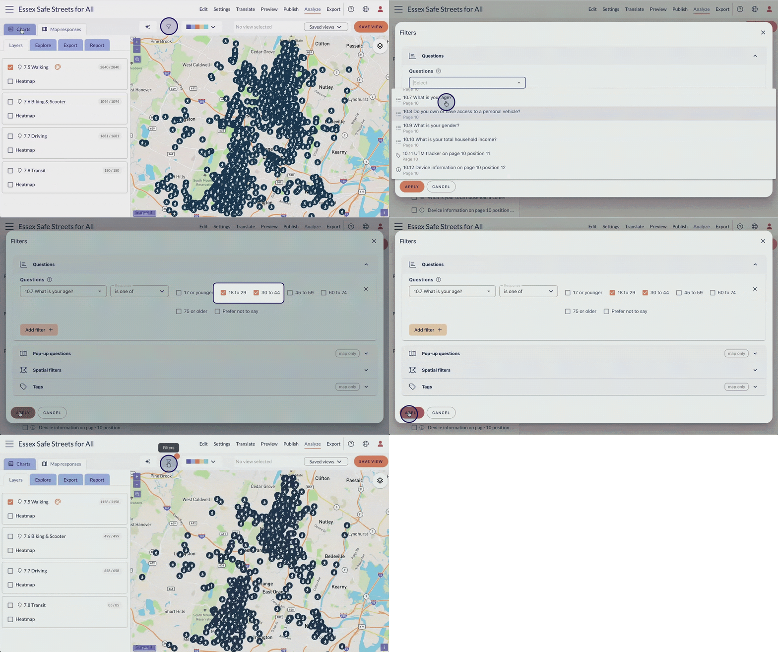
How do you see what one group of respondents said?
A non-negotiable step when there's questions about equity, reach, or inclusion (i.e. always). This “who” data comes from background and context questions:
- Demographic and socioeconomic —gender, age group, income group, etc.
- Project-specific — how you travel, your housing situation, etc.
Filtering based on these answers lets you focus on certain people: low-income respondents, young people, people who do (or don't) ride scooters, or any combination thereof. In Maptionnaire, every chart and every map will update instantly to display the responses from just that filtered group. What used to require exporting and manually sorting in a spreadsheet is now just a couple clicks.
How do you analyze a single area (without a GIS analyst)?
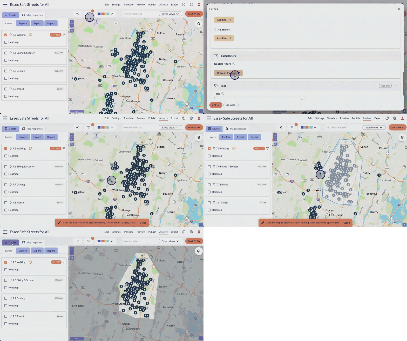
Is a stakeholder eager to focus on the comments on First Street? No problem, just draw a boundary around it. When you draw a boundary on the map, you can focus in on just one area's responses. You might learn that First Street has surprisingly few scooter concerns, or surprisingly many comments from low-income community members.
All of that demographic, socioeconomic, and categorical information gets filtered too. This spatial analysis is impossible in a spreadsheet or traditional survey tool, but takes a few clicks in Maptionnaire.
Can AI tag and summarize open-ended responses reliably?
Tagging (or “coding”) open-ended responses is a rigorous and tedious process. A best practice is that two humans should work separately, reading and tagging all responses, before comparing and consolidating everything. Definitely do this if you can.
But if your alternative is to do tagging alone, or to skip tagging altogether and cherry-pick favorite quotes, consider using AI in your process. Not to replace human judgement, but to offer a first pass or a bias-check in an otherwise slow, error-prone process.
As of 2026, dumping survey results into an LLM does not give you reliable tagging results. This can lead to some unusual cherry-picking. That's why Maptionnaire's built-in AI works in a methodical three-step process: First it reads all comments and deduces the 5-10 most frequent and relevant tags, then it goes through all comments again to apply those tags, and finally it builds a narrative from the tagged comments. You can compare its tagging results against your own, iterate, and edit as needed.
The value isn't that AI replaces judgment. It does the exhausting first (or second) pass, so you can refocus that time on verifying, interpreting, and digging in deeper.
What makes an AI-assisted spatial analysis defensible?
Saving time doesn't matter if the result can't hold up when a client or reviewer pushes back. Here it does:
- Every step is visible and reproducible — yes, even the AI part.
- No black boxes or cherry-picking.
- The filters and prompts are a clear audit trail.
- Anyone can retrace the same steps and land on the same subset.
That's the difference between noticing a pattern and being able to show exactly how you isolated it and what data backs it up.
From collection to analysis to communication, without leaving the dataset
This is where the spatial-first approach pays off a second time.
Because collection, analysis, and reporting run on the same underlying dataset, a filtered, saved view doesn't just sit in an analysis tool. It becomes the reporting material directly: styled charts, a map image, a written summary, all pulled from the same source rather than rebuilt from screenshots in a separate document. Collecting in one tool, analyzing in another, and communicating in a third used to be three disconnected tasks. Now it's one continuous flow.
That continuity is also what makes closing the loop with the public easy. The same defensible, traceable findings that went into the client report can go back to the community too: what they told you, where, and what changed because of it. You don't have to rebuild any of it for that audience.
Save the work so none of it disappears
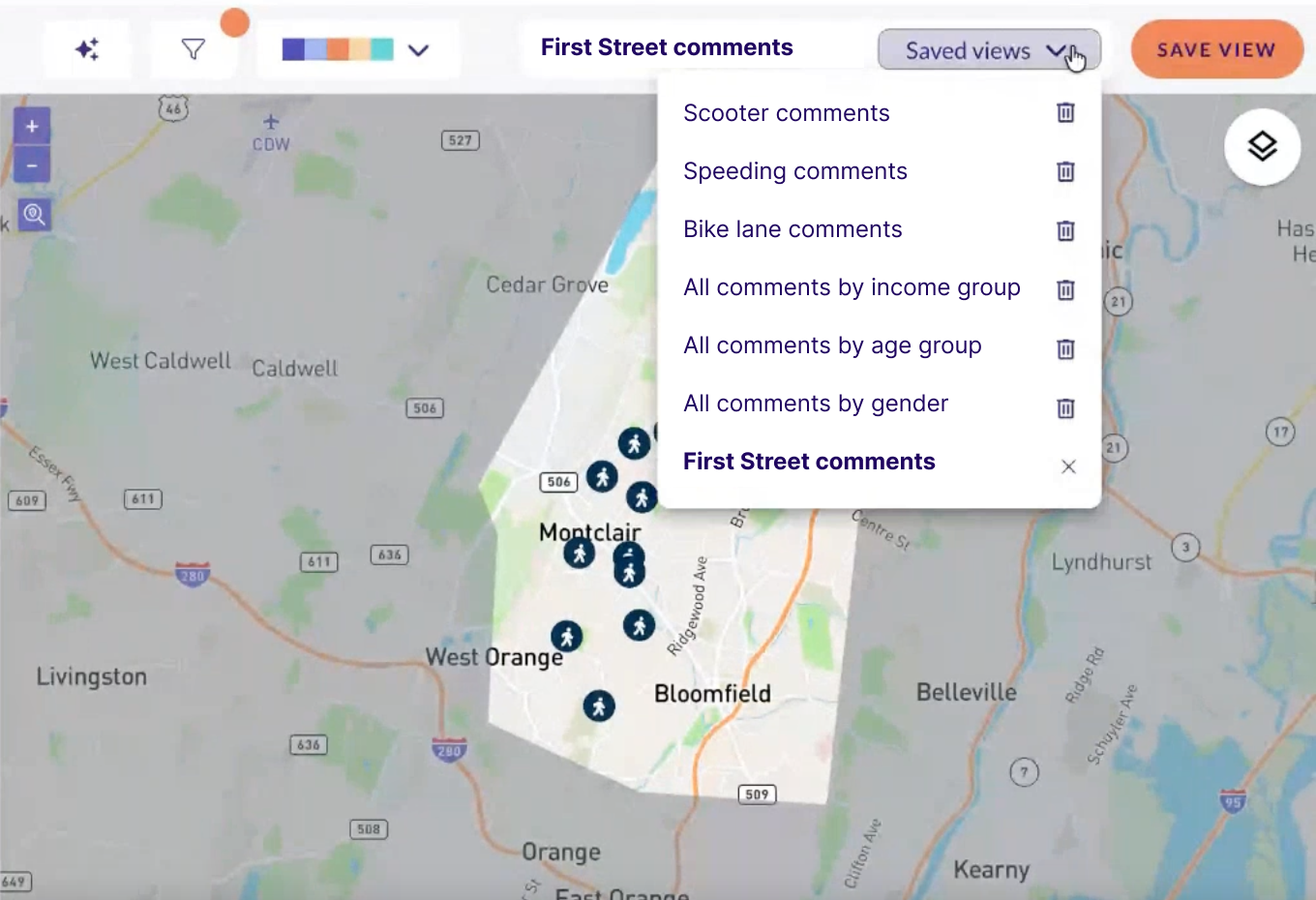
Once a filtered view turns up something worth keeping, save it. A saved view keeps the filters, chart styling, and map position together under one name. Three weeks later, when the client asks a follow-up question, you or a colleague can reopen the exact same analysis in seconds instead of rebuilding it. On a team where more than one person analyzes the same project, saved views hand off findings without redoing the work. A teammate opens “the school-safety cluster in the north district” instead of you re-explaining it from memory.
The throughline
Collect geospatial results and analysis stops being a separate project: it's a few filters that take a few seconds each. Analyze in the same place and reporting is no longer a rebuild, just the same saved views, styled for a client. Report from real filters, and looping back to the public isn't a second project either. It's the same defensible findings, shared. The time saved isn't in any single step; it's in never having to stop, export, switch tools, or start over between them.
Curious what this looks like on a live dataset, including how AI-assisted reporting builds on the same saved views? Watch the recording of our webinar, Live Training: AI and Analytics

.png)
%20(1).png)




.png)

.webp)


.webp)

-min.webp)
.webp)
.webp)


.webp)


.webp)


.webp)


.webp)
.webp)
.webp)


.webp)


